Data-Driven Fabric Architecture: Visualizing GPU Traffic Patterns Over PCIe
Architectural decisions for a high-performance I/O-memory fabric should be grounded in data, not gut feel. It sounds obvious, but in practice the pressure to “just pick something reasonable” is real — timelines are tight, the design space is enormous, and canonical answers are rarely published. The antidote is to look at the traffic before committing silicon resources to serve it.
Why Data Beats Intuition
A fabric connects requesters (CPUs, GPUs, DMA engines) to completers (memory controllers, device BARs, config space). Every design knob — queue depths, arbitration weights, credit pools, virtual-channel allocation — depends on the statistical properties of the workload:
- Burst length distribution — Are transfers predominantly small (doorbell writes, MMIO) or large (bulk DMA)?
- Temporal locality — Do requests arrive in steady streams or in bursty clusters separated by idle gaps?
- Address-space coverage — Is the traffic spread uniformly, or does it hammer a small set of address regions?
- Correlation between fields — Do payload contents, addresses, and timing carry hidden structure a flat histogram would miss?
Getting even one of these wrong can over-provision a path nobody uses or starve the one that matters.
A Concrete Example: NVIDIA GPU SM Writes Over PCIe
To illustrate the approach, consider a real PCIe trace captured while an NVIDIA H100 GPU executes a streaming-write (SM-initiated) bandwidth test using NVBandwidth. The trace records every TLP on the link — type, address, length, payload, and timestamp — giving a cycle-accurate picture of the traffic the fabric must handle.
The Analysis Pipeline
The analysis script (analyze_trace_data_animation.py) follows a straightforward pipeline:
- Load & filter — Read the protocol-analyzer CSV export. Keep only upstream
MWr(64)TLPs (the GPU’s posted writes heading toward the host). - Parse fields — Extract the payload’s first data word (16-bit, big-endian), the target address bits, and the timestamp.
- Bucket & window — Divide the trace timeline into 50 equal time bins. For each bin, aggregate over a sliding window of the preceding 10 bins to smooth transient spikes.
- Group & color — Map the first-word values into 33-element buckets so the histogram bar count stays readable. Each bucket gets a distinct color from a rainbow-gradient palette.
- Render frames → GIF — Build one HoloViews
Barsplot per time bin, export each frame to PNG via headless Chrome (bokeh.io.export_png), then stitch the PNGs into an animated GIF withimageio.
The Result
The animated histogram below shows how the distribution of first-word values in 2-dword posted writes evolves over the life of the trace. Each colored bar is one 33-value bucket; the y-axis is occurrence count within the sliding window.
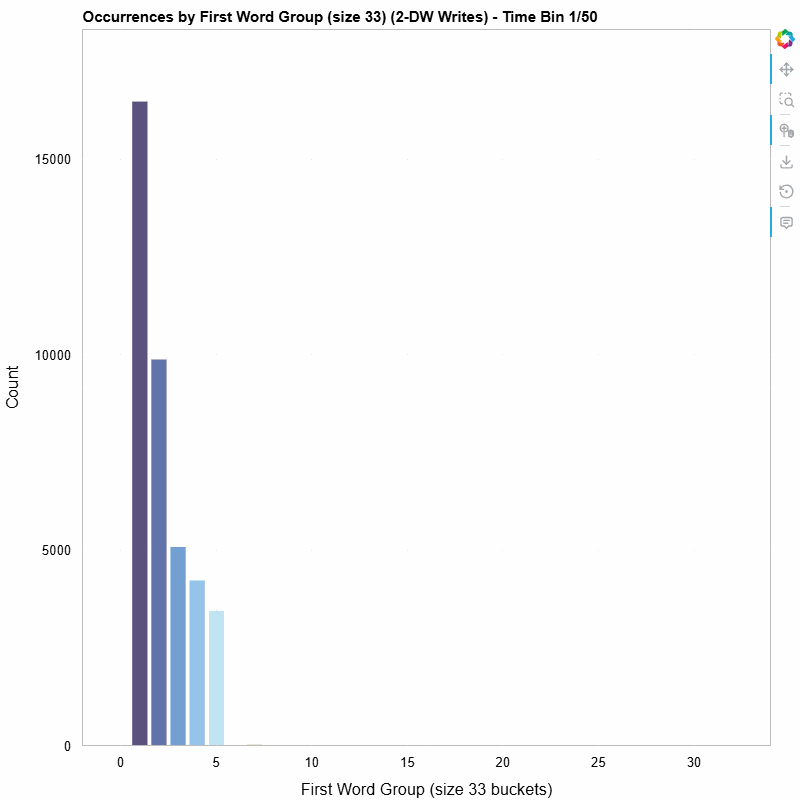 First-word distribution of 2-DW MWr(64) TLPs, bucketed into groups of 33, animated across 50 time bins (10-bin sliding window).
A few things jump out immediately:
- Non-uniform distribution — The writes are not spread evenly across the value space. Certain buckets dominate, revealing structure in how the SMs organize their write data.
- Temporal variation — The shape of the histogram shifts over time. Some buckets appear or disappear as the workload progresses, suggesting phased behavior in the GPU’s memory access pattern.
- Clustering — Adjacent buckets often move together, hinting at spatial locality in the data values the SMs produce.
None of these observations are obvious from aggregate statistics alone. The animation makes them visible at a glance.
Tools & Stack
| Component | Role |
|---|---|
| pandas / numpy | Data loading, filtering, binning |
| HoloViews + Bokeh | Declarative plot construction and rendering |
| Selenium + headless Chrome | Server-side PNG export of Bokeh figures |
| imageio | Animated GIF assembly |
| Python 3 | Glue |
The full script is available in the repository: python-scripts/work/analyze_trace_data_animation.py.
Takeaway
Before committing transistors to a fabric micro-architecture, capture real traffic, visualize it, and let the data constrain the design space. A one-afternoon analysis script can surface patterns that save months of late-stage re-work — and animated visualizations make those patterns legible to the entire team, not just the person who ran the numbers.